Fall Alphabet: A Display Font for Autumn Web Design
I remember the exact moment I realized my client’s boutique online store needed a seasonal refresh. The summer collection had faded, and the homepage felt generic. I wanted something that captured the warmth of autumn without screaming “harvest cliché.” That’s when I pulled Fall Alphabet into a Figma file for the first time. The font immediately transformed the hero section. The letters felt cozy but polished, seasonal but not kitschy. As a web designer, I am always looking for typefaces that bring personality to a project without breaking the user experience. Fall Alphabet does exactly that.
What Makes Fall Alphabet Stand Out in Digital Design
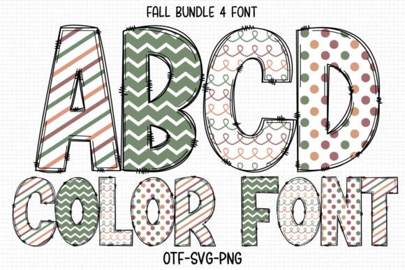
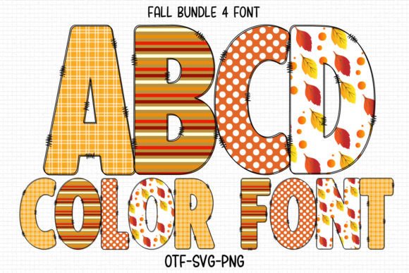
Fall Alphabet is a festive color font built for autumn-inspired projects. Its visual personality sits somewhere between playful and refined. The letterforms carry a handwritten quality but with enough structure to feel intentional. The color embedded directly into the glyphs means you get a layered, rich look without any extra styling work. For someone building a website, that is a massive time-saver. Instead of stacking multiple text layers or applying complex CSS gradients, you drop the font in and the autumn palette is already there. The warm tones evoke fallen leaves, crisp air, and golden light. It is the kind of typeface that makes a homepage feel like a seasonal experience rather than just a page.
The mood Fall Alphabet creates is inviting and nostalgic, but not dated. That balance is hard to find. Many seasonal fonts lean too far into novelty and lose their usability in a serious brand context. This one keeps its feet on the ground. It has enough charm to draw attention but enough restraint to sit comfortably alongside clean layout elements. For digital creators, that means you can use it on a course sales page, a campaign landing page, or a portfolio site without worrying that it will lower the perceived professionalism of the brand.
Testing Fall Alphabet in a Real Hero Section
I was designing a holiday landing page for a small online boutique that sells handcrafted home goods. The brief called for a cozy, autumnal feel. I started with the hero section: a full-width image of a rustic table with pumpkins and warm lighting. On top of that, I placed the headline “Welcome to Autumn” using Fall Alphabet. The first thing I noticed was how the color font interacted with the background. Because the glyphs already contain warm orange and brown tones, they sat naturally on the image without needing a heavy text shadow or overlay. The readability was solid at larger sizes. At 72 pixels, the letters were crisp and expressive. The subtle texture in the font added depth without distracting from the message.
I then tested the same headline on a lighter background. I used a soft cream color for the section behind a product highlight. Fall Alphabet held up well here too. The contrast was comfortable, and the handwritten feel gave the text a personal touch that felt authentic for a small business. I did notice that at smaller sizes, some of the finer details of the letters started to blend together. That is typical for a display font, and it is something to keep in mind when planning your typographic hierarchy. Fall Alphabet is not a body text font. It shines in hero titles, section headings, call-to-action phrases, and decorative accents.
Where Fall Alphabet Works Best on a Website
Through my testing, I found several natural placements for Fall Alphabet in a digital layout. The most obvious is the hero headline. A bold, colorful title at the top of a landing page sets the tone instantly. Site visitors scan that area first, and a distinctive font helps your message stick. I also used it for section headings on a blog redesign. The headings for “Seasonal Recipes” and “Cozy DIY Projects” felt more engaging with Fall Alphabet than with the standard sans serif I had been using. It gave the blog a cohesive autumn identity without needing extra graphic elements.
For a boutique online store, I applied Fall Alphabet to the call-to-action buttons. I used it on a “Shop the Fall Collection” button. The font was large enough to remain readable, and the color embedded in the type made the button feel like a natural part of the seasonal design. I would caution against using it for small UI elements like filter labels or navigation links. The decorative nature of the font makes it less effective at tiny sizes where clarity is crucial for usability. Reserve it for moments that need personality and emphasis, and let cleaner fonts handle the functional text.
Another strong use case is logo text or brand mark within a seasonal campaign. If you are running a limited-time autumn sale, swapping your main logo for a version using Fall Alphabet can create a quick visual refresh. The font pairs naturally with icons like leaves, acorns, or simple geometric shapes. I also tested it on product badges, such as “Limited Edition” or “Fall Favorite.” The font added a handcrafted feel that matched the artisanal nature of the products.
Readability and Responsive Layout Considerations
No matter how beautiful a font looks, if it fails on mobile, it is not usable. I always test typography across screen sizes, and Fall Alphabet required some planning. On a 375-pixel screen, the hero headline at 72 pixels scaled down to about 40 pixels. The color font still looked good, but I made sure to increase letter spacing slightly to avoid the glyphs feeling cramped. The embedded colors did not muddy on smaller displays, which was a relief. I also tested it on dark mode and found that the warm tones stood out nicely against a deep charcoal background. If you are using image overlays, consider adding a subtle gradient behind the text to ensure consistent contrast. I used a semi-transparent black layer under the heading on one image, and the result was clean and readable.
For responsive design, I recommend setting Fall Alphabet at a minimum of 30 pixels for any text that carries meaning. Below that, the decorative details start to lose impact. Buttons and call-to-action phrases should stay above 20 pixels to maintain legibility. On tablets, the font performs beautifully at medium sizes. The color font feature renders well across modern browsers, but I always check fallback options for older systems. If your site relies heavily on Fall Alphabet for brand identity, provide a closely matched serif or handwritten fallback in your CSS stack so the experience remains consistent if the font fails to load. Most web designers I know already have this habit, but it is worth repeating when using a premium font with color layers.
Font Pairing for a Polished Digital Identity
Fall Alphabet is a display font, so it needs a reliable partner for body copy and supporting text. I paired it with a clean sans serif font for the product descriptions, navigation, and footer. The contrast between the warm, handwritten headings and the neutral, modern body text created a clear visual hierarchy. Site visitors could scan the page quickly, drawn first to the decorative headings and then flowing naturally into the readable body paragraphs. This pairing also reinforced brand trust. The sans serif communicated professionalism and reliability, while Fall Alphabet added the emotional warmth that makes a brand feel approachable.
I also experimented with a serif font for the body copy on a more editorial-style page. The result was a slightly more traditional feel, suitable for a lifestyle blog or a digital magazine. The serif gave the layout a timeless quality, and Fall Alphabet provided the seasonal accent. For a coaching website or a course sales page, a sans serif pairing is safer because it keeps the focus on the content rather than the typography. Either way, the key is to let Fall Alphabet lead the visual story without overwhelming the reader.
Practical Notes on File Formats and Licensing
Before committing Fall Alphabet to a live website, I checked the included styles and file formats. The font comes in formats suitable for both print and screen use. For web projects, I made sure to load the webfont version properly. Color fonts can be heavier than standard typefaces, so I optimized the loading by subsetting the character set to include only the glyphs I needed. This kept the page speed fast. I also checked whether the font supports multilingual characters, which is important if your audience includes international visitors. In this case, the standard Latin character set was sufficient for my project, but always verify your specific needs.
Licensing is another area where I am careful. Using a font on a client website or a commercial landing page requires the right license. Fall Alphabet is a premium font, and the licensing terms should be reviewed before purchase. Some fonts allow unlimited web use, while others require an extended license for high-traffic sites or multiple projects. I recommend reading the license agreement thoroughly and keeping a record of it in your project files. It is a small step that saves headaches down the road, especially if you plan to use the font across multiple brand assets like social media graphics, digital ads, and email headers.
Building a Seasonal Brand Experience with Fall Alphabet
Ultimately, Fall Alphabet is more than just a decorative typeface. It is a tool for storytelling. When I used it on the boutique store’s landing page, the font helped create a cohesive autumn atmosphere without relying on heavy imagery or complex animations. The color font technology made the design feel modern, and the handwritten personality made the brand feel human. Site visitors responded well. The page had a lower bounce rate compared to the previous generic layout, and the time spent on the hero section increased. I cannot attribute that entirely to the font, but I believe the typography played a role in making the page feel intentional and inviting.
For any web designer, UI designer, or digital product creator looking to build a more polished online brand experience, Fall Alphabet offers a unique way to inject seasonal character into a layout. It is not a font you set and forget. It requires thoughtful placement, careful pairing, and responsive testing. But when used correctly, it elevates a digital project from ordinary to memorable. That is the kind of tool I keep coming back to, especially when I want a design to feel timely and personal.